The waiting room Pacific Crest Trail wall graphic engages children to explore the trail from Canada to Mexico.
PACIFIC CREST CHILDREN'S URGENT CARE CLinic
Portland, OR
When Pacific Crest Children’s asked us to design their new pediatric urgent care clinic, three potential locations were on the table. We visited each with our client, Dr. Corey Fish, and we all agreed the clear favorite was a storefront in the historic Goodrich building in the northeast Portland neighborhood of Roseway.
The building's namesake and original architect, Burton Goodrich, was an understudy of Frank Lloyd Wright, but given the structure’s state of disrepair, someone with less vision than Ethos Development might have mistaken it for a tear-down. Instead they undertook a skillful renovation to bring this mid-century modern gem back to life, delivering a raw space ready for build-out to our team.
From space-planning through interior design, WC STUDIO worked with Dr. Fish to balance the technical requirements of a medical office with design elements to delight young patients, parents, and staff. Many of these elements riff off the clinic name, it’s geographic location in the Pacific Northwest, and the logo graphics and color scheme developed by Caitlin Dale.
The shape of the check-in counter mimics the clinic logo in birch plywood and a “valley” between mountain peaks provides a lower section of countertop where smaller children can engage with staff. Waiting room guests can explore an 8-foot tall etched plywood map of the Pacific Crest Trail—custom designed and fabricated by WC STUDIO with the help of Edensaw’s CNC shop.
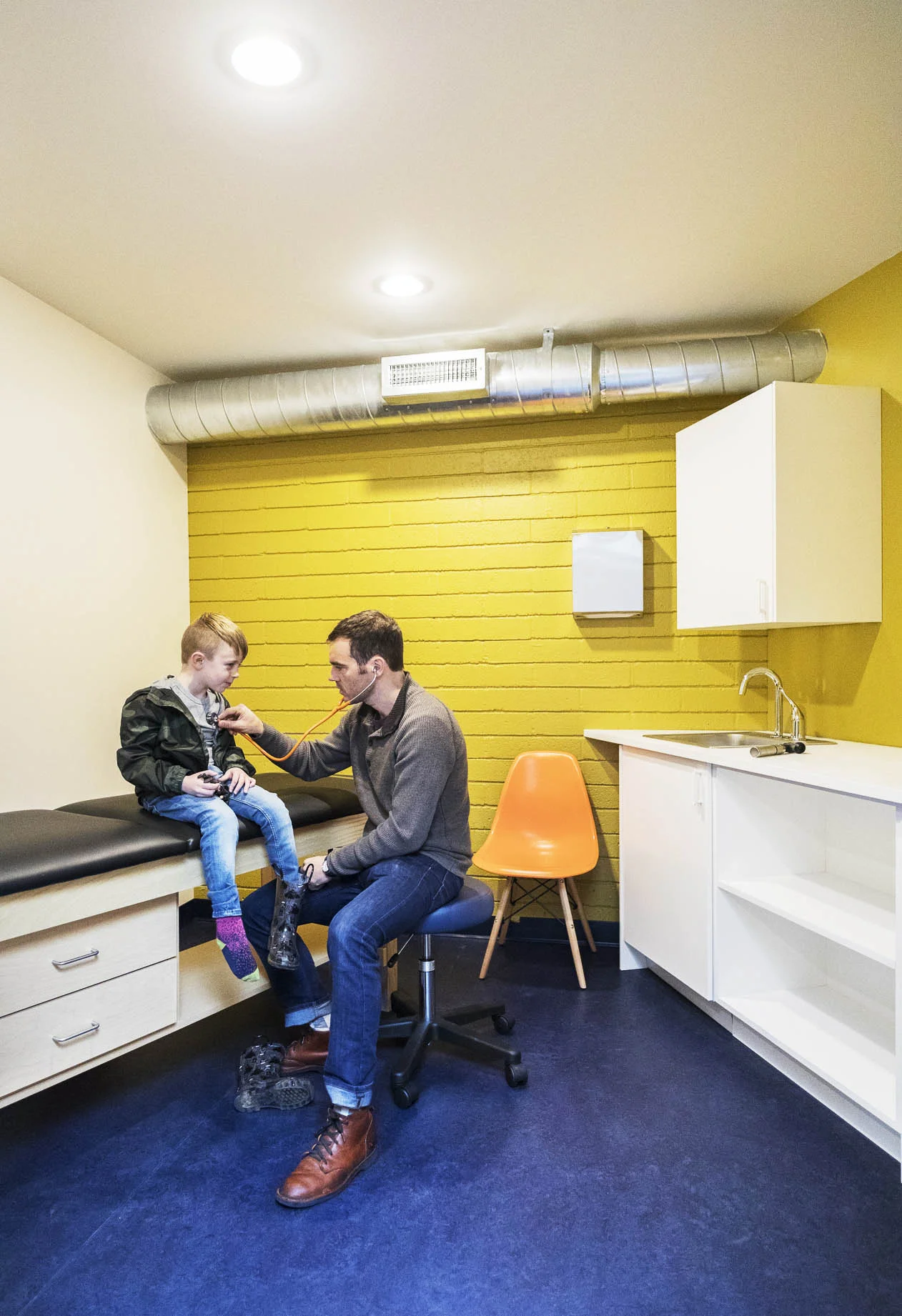
The main corridor is filled with daylight from overhead skylights and clerestory windows. Mountain graphics, echoing the clinic logo, line the corridor walls. This central circulation spine expands and contracts according to function, such as the baby weighing and measuring station. Opposite the charting station, an oversized pegboard, bench and cubbies create a place for boots, coats and bags. Sidelights provide a visual connection into the doctor and staff offices to further activate the corridor. The exam rooms feature accent walls and textures from the historic building highlighted in bright paints to match the clinic’s brand colors.
Simple, durable, and sustainable materials like FSC certified plywood, low VOC paints, felt, and marmoleum flooring were used in combination with polished concrete and exposed rafter ceilings. The result is both playful and industrial, a place where Portland kids of all ages can feel comfortable and receive expert care.
“WC STUDIO does amazing work. Their sense of style and attention to detail are second to none”. Owner
General Contractor Siteworks
Photos by Steve Campagna
Wall materials from the historic building are highlighted in many of the exam rooms with a coat of lively colored paint.
The reception desk provides a lower height section for kids to engage with the staff and the plywood facing picks up details from the Clinic logo.
The main corridor is filled with daylight from overhead skylights and clerestory windows.
An oversized pegboard, bench and cubbies create a place for boots, coats and bags. Logo below by Caitlin Dale.
Mountain graphics, similar to the logo, are painted on many of the walls.
The central corridor widens where functions like charting or the weighing and measuring station occur. Interior glazing provides visual connections with the doctor and staff offices.
Computer-numeric-controlled (CNC) milling technology was used to produce a custom-designed plywood map of the Pacific Crest Trail for a waiting room wall.
Floor plan of the clinic


